.png)
5 UX Hacks That Skyrocketed Fintech Conversions

1. User-Friendly Explanations & Clear Actions
Financial terms can be intimidating. Simplify them into plain, digestible language. Replace jargon with clear explanations, interactive guides, and easy-to-follow steps. When users understand what they’re doing, they’re more likely to take action with confidence.
Tip: Use progress indicators, tooltips, or short descriptions to guide users through complex flows.
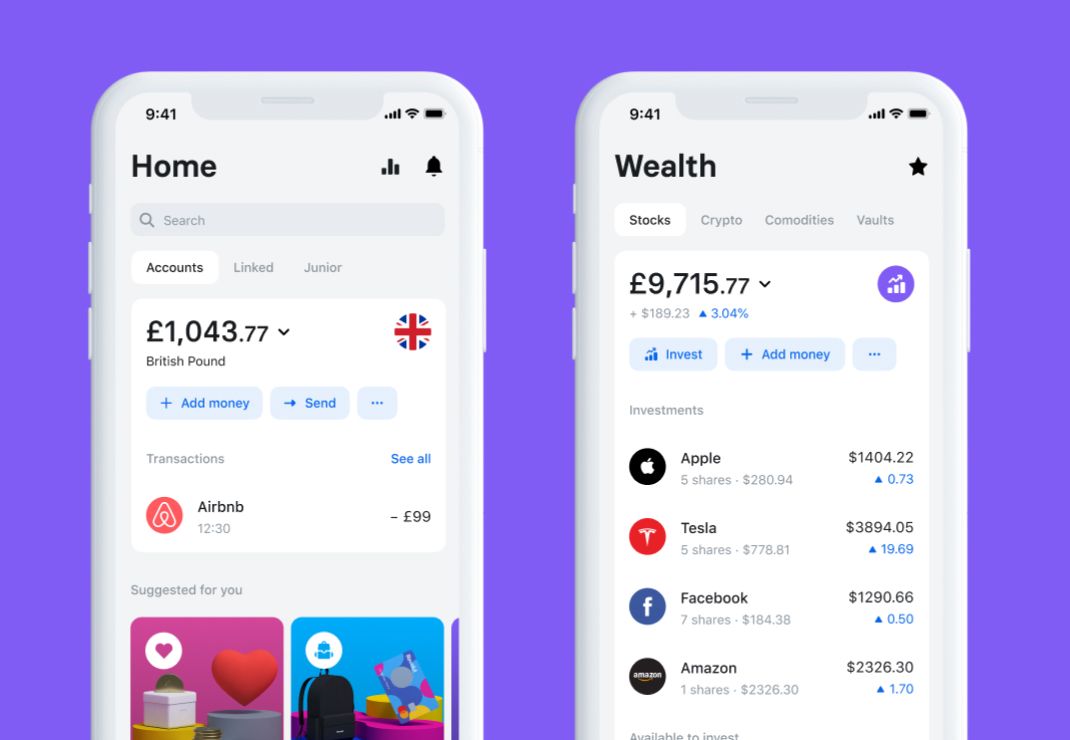
2. Transparent Data Visualization
Numbers can overwhelm users if they’re not visualized properly. Replace cluttered spreadsheets with clean charts, graphs, and dashboards. Transparency in showing where money comes and goes instantly increases trust.
Compliance + User-Centricity = Trust
3. Test, Iterate, and Educate
Fintech regulations and user expectations evolve fast. Instead of static design, run A/B tests, usability sessions, and iterative updates. Teach your users through tooltips, FAQs, and micro-copy—help them feel educated, not lost.
4. Understand Regulations Early
Most fintech startups delay compliance until the last minute—leading to costly redesigns. Bake regulations into your UX strategy from day one. When compliance is part of your design DNA, you build stronger foundations and avoid setbacks.
Remember: Compliance doesn’t restrict creativity—it guides it.
5. Prioritize Clarity in Every Step
Whether it’s onboarding, KYC verification, or transaction flows—clarity beats cleverness. Use straightforward copy, clear CTAs, and step-by-step processes. When users feel secure, conversion rates go up.
Pro UX Writing Tips That Boosted Results
- Capitalize Smartly → Emphasize important words, but don’t overdo it.
- Swap "if" for "when" → Certainty inspires confidence.
- Use Numbers → Odd numbers stand out (e.g., 87% of users trust apps with clear compliance).
Final Thoughts
Fintech design success comes from a balance between user experience and compliance. By simplifying complex terms, visualizing data, embracing regulations early, and testing continuously, you can increase conversions and build trust at the same time.
When startups treat compliance not as a burden but as a design cornerstone, they set themselves apart in a crowded market.
⚡ Helping startups reach their UI/UX goals that converts.
Stuck in what to design?
Fresh eyes help generate new perspectives. Book a free call in which we identify opportunities and broken flows in your website or product.

.svg)