.png)
Smart AB Testing Boosted Conversions from 1.66% to 5.71%

The Secret: Data-Driven A/B Testing
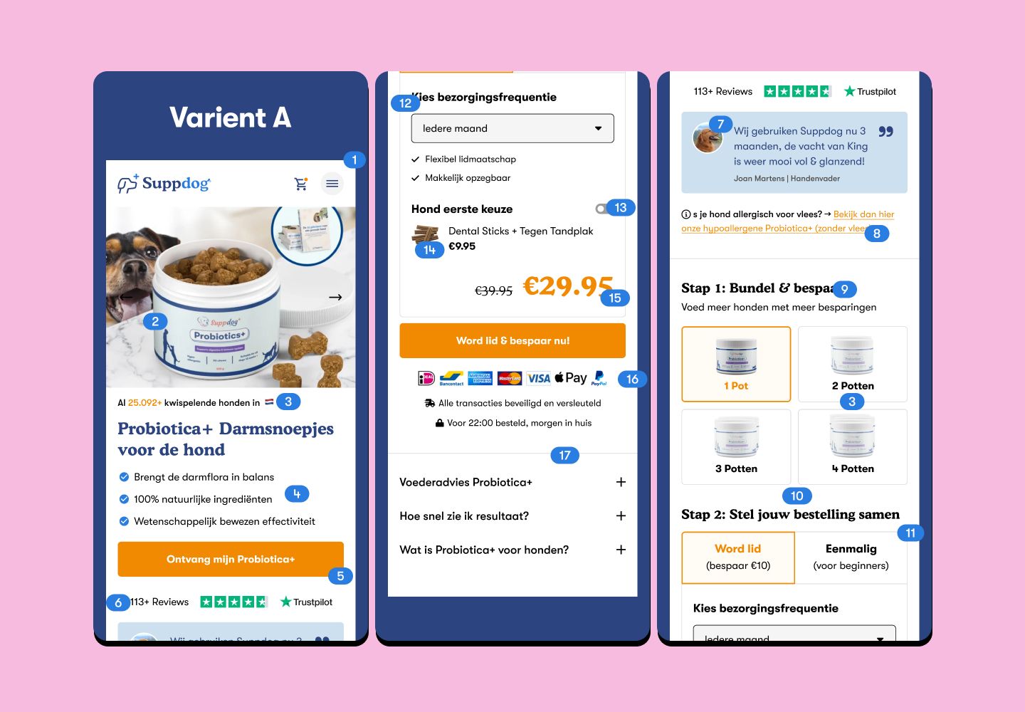
By testing, measuring, and optimizing based on real user behavior, I boosted conversions by adding a happy dog image to increase engagement, refining the hero section with featured icons for clarity, reducing highlights from 7 to 3 to focus messaging, placing key content in the first fold for instant visibility, and moving the CTA closer to the thumb for easier access. Here is what I did:
✅ Added a happy dog image
➝ Positive emotions increase engagement.
✅ Optimized the hero section
➝ Added featured icons for clarity and trust.
✅ Reduced highlights from 7 to 3
➝ Focused messaging boosted CRO by 30%.
✅ Wrapped everything in the first fold
➝ Users saw the value instantly, without scrolling.
✅ Moved the CTA closer to the thumb
➝ Easier access = higher clicks.
The Best Part?
None of these changes required a complete site overhaul. Just smart testing and conversion-focused adjustments.
This is proof that even small design and UX improvements can dramatically improve results.
Key Takeaway
Stop guessing what works. Start testing, measuring, and making decisions backed by data.
When you build a website with conversion optimization in mind, growth becomes measurable—and inevitable.
👉 FahaddeArtist helps startups and businesses in Berlin (and globally) transform their websites into high-performing growth engines with CRO, UI/UX design, and A/B testing strategies.
Stuck in what to design?
Fresh eyes help generate new perspectives. Book a free call in which we identify opportunities and broken flows in your website or product.

.svg)