Background
Clementine Gold Group LLC advises on equity-centred strategy and inclusive workplace cultures. The website needed to reflect that positioning, communicate services and expertise, and speak to its audiences in the United States.

A clear digital identity for a values-led consultancy.
Branding · UX/UI · Webflow
03–08 / 2024 · Webflow, Figma, Hotjar, Google Analytics, A/B Testing
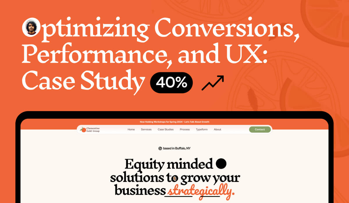
Clementine Gold Group LLC advises on equity-centred strategy and inclusive workplace cultures. The website needed to reflect that positioning, communicate services and expertise, and speak to its audiences in the United States.
The original experience had performance, accessibility and usability issues. It needed to work better across devices and develop a more consistent visual identity. Content and design had to communicate the company’s values clearly.
I refined the logo, colour, typography and interface. The direction combined Inknut Antiqua headings with Cabinet Grotesk body text. Coral accents, green-grey tones and warm pink-orange shades created a distinctive identity for the consultancy.
I simplified the page structure to help visitors find services and relevant information. A coherent journey connects the company’s positioning with practical offers and contact options. Clear hierarchy and understandable content reduce unnecessary detours.
I built the website in Webflow and adapted layouts to different devices. Consistent components, interactions and a clear content structure support maintenance. Performance and accessibility were treated as part of the implementation.
Navigation, layout and calls to action were focused on meaningful next steps. The goal was to reduce friction between interest and contact. Analytics, Hotjar and A/B testing were part of the project context; no invented or retrospectively added conversion figures are displayed.
The design developed through collaboration with the company. Inclusion and equity informed the visual direction and user experience. The published client feedback describes improvements in performance and usability.
A consistent, responsive brand experience with clearer content, simpler navigation and purposeful contact options. The original case study describes engagement and conversion improvements qualitatively. As no detailed measurement series was published, those outcomes are not assigned unsupported percentages here.
Let’s talk about it. Together, we’ll find the next step that makes sense for your business.
Book a free introduction