
Start with the problem
Begin with an observation: do visitors miss the product’s value, or struggle to find the mobile CTA? Turn that into a hypothesis. Define the main goal in advance, such as a qualified enquiry, instead of counting any click as success.
The Suppdog example
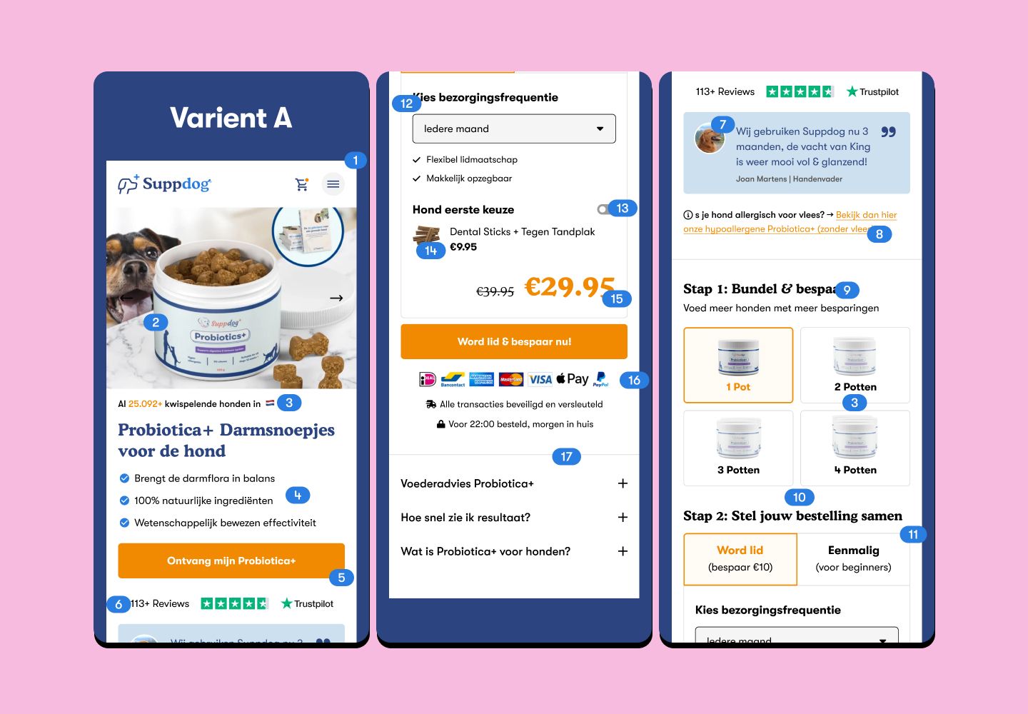
The original Suppdog work explored a more relevant dog image, supporting icons, shorter benefit copy and better placement of important content. Seven main selling points were reduced to three. On mobile, the focus included making the primary action easier to reach.
Separate changes thoughtfully
Changing imagery, copy and structure at once makes individual effects difficult to isolate. A full redesign may be useful, but it answers a different question from a targeted experiment. Record variants, duration, traffic sources and other material changes.
Learn differently with limited traffic
Small websites often have too few conversions for short A/B tests. Task-based usability sessions, interviews and journey reviews can be more useful. Treat before-and-after figures cautiously because seasonality, campaigns and audience changes can affect them.