Background
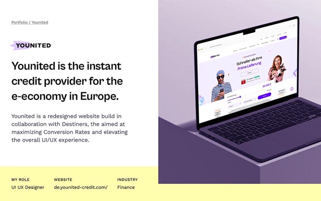
Younited provides digital credit products in Europe. The product was already live. My role covered UX research, competitor analysis, user and stakeholder interviews, UI design and illustration.

Making complex financial products easier to understand.
UX Research · UI Design · CRO
01–07 / 2023 · Webflow, Figma, Hotjar, Google Analytics, A/B Testing
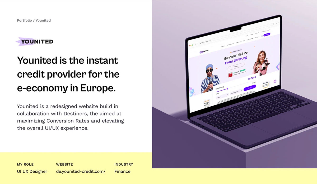
Younited provides digital credit products in Europe. The product was already live. My role covered UX research, competitor analysis, user and stakeholder interviews, UI design and illustration.
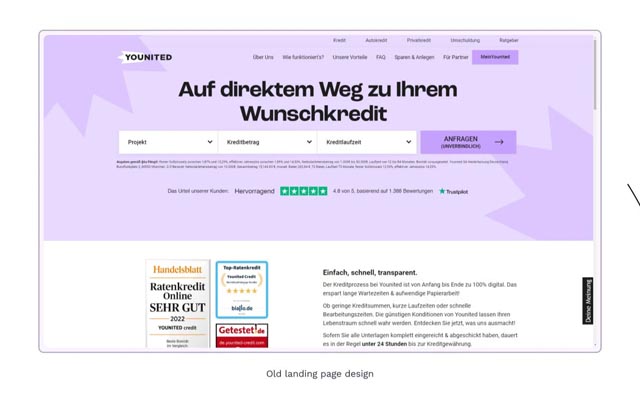
The existing website did not communicate the financial offer clearly enough at first contact. The landing page lacked a coherent user journey, and the path to a credit application needed improvement despite paid marketing activity. The application process was not consistently understandable.
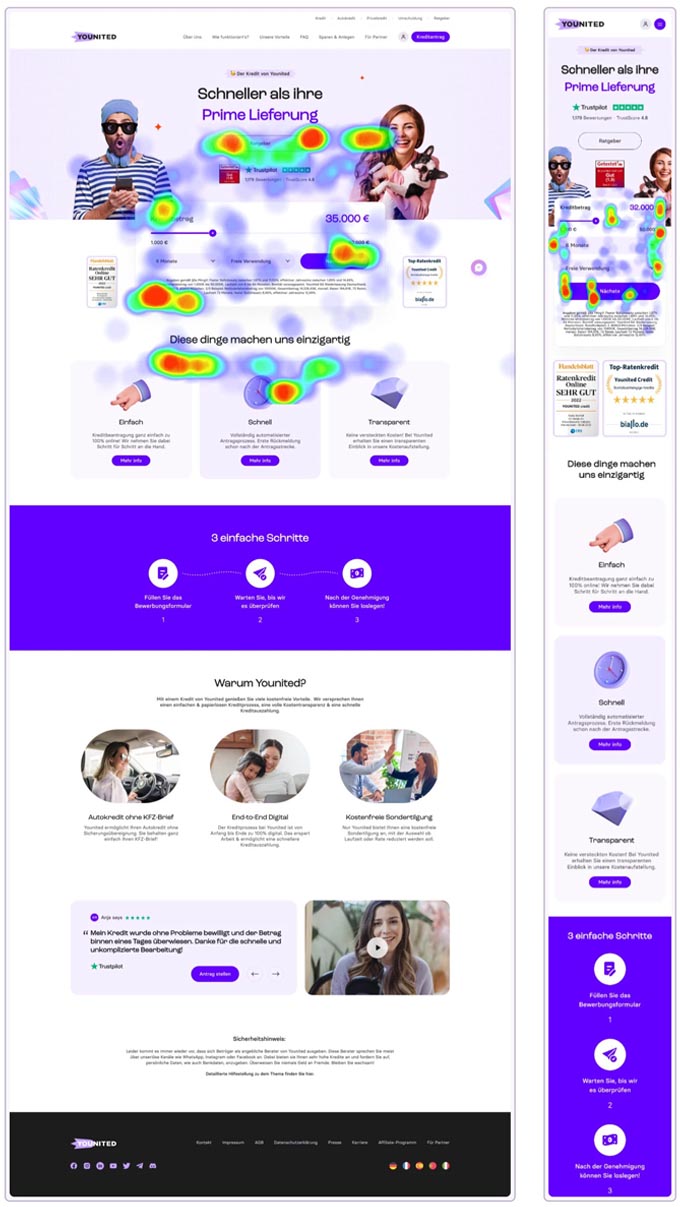
I used more than 1,300 existing Trustpilot reviews as a qualitative research source. Hotjar and Google Analytics added information on devices, journeys, interactions and heatmaps. The aim was to identify recurring questions and friction in real use.
The original case study records approximately 80 percent mobile-first usage and a substantial 20–30 age group. These historical notes describe that project, not the market in general. Observed problems included distraction, unclear next steps, weak calls to action and loss of interest soon after arriving.
The process included primary and secondary research, interviews, competitor analysis, affinity mapping, empathy mapping, personas and user flows. Critical tasks were prioritized, informing wireframes, a design system, high-fidelity prototypes and usability testing.
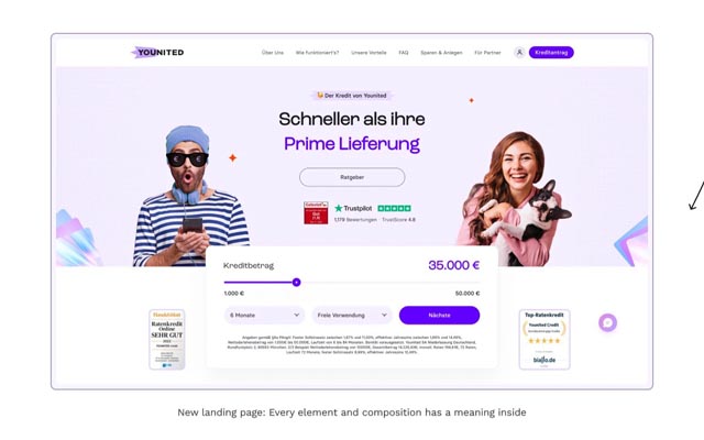
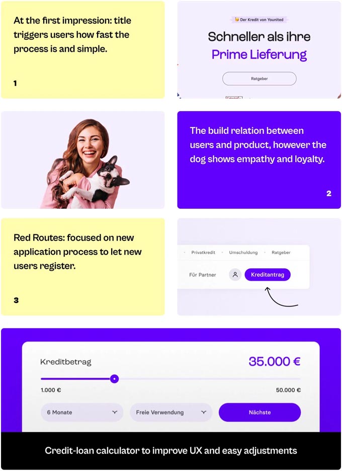
A restrained interface, understandable content and a focused hierarchy were intended to reduce the complexity of the financial offer. Colour, typography and imagery supported trust and orientation. Clear calls to action and sequential steps made the application journey easier to follow.
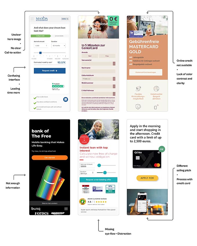
The competitor review informed priorities for mobile design, CTAs, user flows and relevant trust signals. Design decisions were linked to feedback and A/B testing, rather than assuming that visual changes automatically produce more applications.
My work connected UI/UX design with Webflow implementation, interactions and performance. A clearer structure, consistent brand experience and more understandable communication supported the revised product experience.
Let’s talk about it. Together, we’ll find the next step that makes sense for your business.
Book a free introduction